Tag Archives: Nielsen

Watch the throne: Who takes the media crown during royal weddings?

If it seems like Harry and Meghan have taken over your social media feeds, or you’ve been sucked in to the wall-to-wall news coverage about the Royal Wedding, you’re not alone.  No matter whether you live in the U.K., commonwealth countries, or even in the U.S.A., it feels like the whole world is on edge for the Windsor family’s next wedding. You might even call it the most anticipated wedding since Robb Stark married Talisa (although hopefully with a happier ending).

And this is nothing new – back in 2011 I used Nielsen’s analytics tools to measure media buzz about Harry’s older brother Prince William marrying the future Duchess of Cambridge, Kate Middleton.  Surprisingly we found that American news outlets covered that Royal Wedding more frequently than their UK or Commonwealth counterparts. Back then William was most mentioned in social media, except in the UK where Brittons were abuzz about the people’s princess.  Overall Americans made the most noise about the Royal Wedding in social media, although Brittons had a higher share-of-voice on the topic, which seemed to be on everyone’s mind up to the big day.

It seems like history is repeating itself for Prince Harry, so I thought it might be fun to take one last look back at the first Royal Wedding of the social media age: Continue reading Watch the throne: Who takes the media crown during royal weddings?

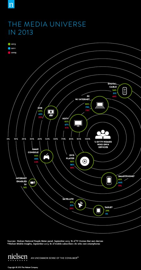
Media Universe: Exploring Consumers’ Expanding Use of Digital Devices

Media device ownership in 2013

Today consumers own more devices than ever before, and the greatest growth comes from digital devices, many of which didn’t even exist a few years ago.  If fact, according to Nielsen’s recent Digital Consumer Report (full disclosure: I helped research and create this report) not only do the majority of Americans now own smartphones, but during 2013 time spent accessing the internet using smartphone apps (34 hours per person on average) surpassed time spent surfing the web on computers (27 hours on average).  Whether consumers using the devices to access media or connect with one another, advertisers and marketers must follow consumer’s eyeballs as they jump across multiple screens and platforms.

So where do consumers spend their time and attention when using media? Continue reading Media Universe: Exploring Consumers’ Expanding Use of Digital Devices

Hitchhiker’s Guide: Mapping the Consumer Media Universe

Mapping the Media Universe as a solar system of devices
(click to enlarge the Media Universe infographic)

The media universe is constantly expanding, so as consumers adopt more devices and gadgets their usage of how they watch, shop, and connect continues to evolve; today the media universe revolves around the consumer.  As the media landscape changes, PRs, Advertisers, and Marketers must navigate this new media universe, understanding not just all the gadgets consumers own, but also how they use media across devices to form their own behaviors.

Working with Nielsen’s data to provide insights into cross-platform media usage, I helped design the 2012 Consumer Usage Report from concept through completion, including the above inforgraphic meant to help navigate the media universe just in time for CES in January 2013.  Using the common marketing metaphor of the “universe”, meaning all people in the target audience, this visualization provides a snapshot overview of the US media market.  Visualizing the media universe as a solar system of planets (devices) which revolve around the sun (consumers), this infographic maps consumer ownership of digital devices (computers, mobile, tablets, etc) and devices connected to the TV (cable/satellite, game consoles, etc).  Pulling these devices together is gravity, illustrated by how are consumers spending their media time, and some may be surprised that the overwhelming majority of time spent (150+ hours per month) is watching traditional and time-shifted TV.

At the same time consumers’ media habits are rapidly changing, and the media universe continues to expand to incorporare new devices akin to a technological big bang.  During 2012 smartphones became the majority of mobile users in the US for the first time, and nearly 1 in 5 households now owns a tablet computer.  Social media usage continues to grow, and while many more consumers are using it on the go most still connect to social networks using their home computers.  And for cord-cutters like me who get much of their viewing through online stream sites, it may be surprising to learn only 4% of households own IPTV sets, but with 56% of homes using video game consoles it seems likely at least a few are watching video on Netflix and Hulu on their TVs as well.


To learn more about the how consumers use tech and media in their daily lives, please download the full report from Nielsen’s website.  And to see more examples of infographics and data visualizations I’ve worked on, check out my portfolio on this site.

TV by the Numbers: How I cut-the-cord and share my viewing online

Remote Controller 2
As television networks kick off the upfronts introducing new programs and picking up where existing series left off, there is increasing conversation about using social media to connect fans and viewers with their favorite shows, as well as how many may be cutting-the-cord altogether. Full disclosure: I’m an employee at Nielsen, who have a great perspective of cross-platform insights into what consumers watch, but the measurements shared in this post are my own and are not necessarily shared by my employer.

First, here’s a funny and surprisingly accurate primer on how TV viewing is measured in the US (from Jess3 and ESPN):

Appointment Viewing

For the last two years I’ve been using social media tools like Get Glue, Miso, and IntoNow to track my viewing and to share my favorite TV shows with friends. These social networks use websites and smartphone apps to encourage more social viewing, opening up the sometimes isolated TV watching experience by connecting viewers who check-in to the same program and generating conversations among fans of the shows. For example, here are some of the shows I’ve checked-in to most recently: Continue reading TV by the Numbers: How I cut-the-cord and share my viewing online

Nielsen’s Social Media Report

Data visualization of demographics on social media sites from Nielsen's Social Media Report
Last month Nielsen (my employer) released a new State of the Media report focused on social media use in the US and around the world. This report offers a unique snapshot overview of the social media landscape, using measurements of consumers’ behavior in their browsers rather than survey data. It reveals not only the significant growth among the population visiting social networks and blogs, but also who makes up the audience on these sites and how they use social media.  Here’s a few highlights of its key findings and takeaways:

  • More than 4 in 5 American who are active online visited Social Media websites within the last month
  • About a quarter of all time spent online is using Social Networks & Blog sites, more than twice as much as the next nearest category of websites.
  • Facebook is by far the most popular social networking website globally, and in the U.S. Tumblr is among the fastest growing
  • Growth in social media users comes from people of all ages and increasingly among those aged 55+, making social media more representative of the online population overall

As a member of Nielsen’s global communications team (full disclosure), I helped research and write this report, working together with our thoughts leaders/experts and designers to create compelling data visualizations that help convey Nielsen’s insights into consumer behavior.  The response to the report has been overwhelmingly positive, with coverage by key news media and thousands of links shared across social networks. Of course all ideas/opinions expressed on this site and in social media are my own (and are not necessarily shared by my employer), so hopefully you find the analysis and insight in this report as helpful as I do.

Visit the Nielsen’s website to read the Social Media Report and download a copy of your own.

September’s 7

Matthew Hurst inspects artwork based on the DC metro transit map
Every month I share a short list of ideas that I think deserve recognition, or at least have some currency in my own sphere of influence .  It’s been a little while since I shared my latest influences, so I’ve included an extra thought this month I hope will introduce you to something worthwhile.

App: Chump Dump. I admit that I have a problem: too many friends and followers on Twitter to keep tabs on those who’s ideas I care about the most. This app should help me attain a better balance (or at least a lower ratio) by helping me loose random twitter followers, particularly those most prolific narcissists currently clogging up my Twitter stream.

Blog: Wonkette. With Election season in full swing, I’ve become a daily reader once again of this DC-based liberal rag with its tongue planted firmly in cheek. Sarcasm runs thickly through each post, pulling together the best (and most embarrassing) news clips from around the blogosphere to add their irreverent take on our nation’s partisan political dysfunction.

Film: Scott Pilgrim vs The World. Comic books, video games, rock and roll; what’s not to love in this romantic comedy? Of course it’s geeky, so I love it.

Meme: Check-in Fatigue. As an early adopter of location-based social media, I’ve been anticipating the growth and inevitable backlash against these platforms as they mature. It’s interesting to watch my friends walk through the same curiosity, excitement, and disappointment as these services start to become adopted by the mainstream, most recently Facebook.  What was first a fun, new way to connect with friends and meet people has grown into an all-consuming competition that frustrates new users with legitimate privacy issues.  Of course I’ll still be playing along, so don’t hate the players (hate the game). Continue reading September’s 7